, November 22, 2016
Presenting the New Baffler
An elegant spread for our grade-A ill-tempered content
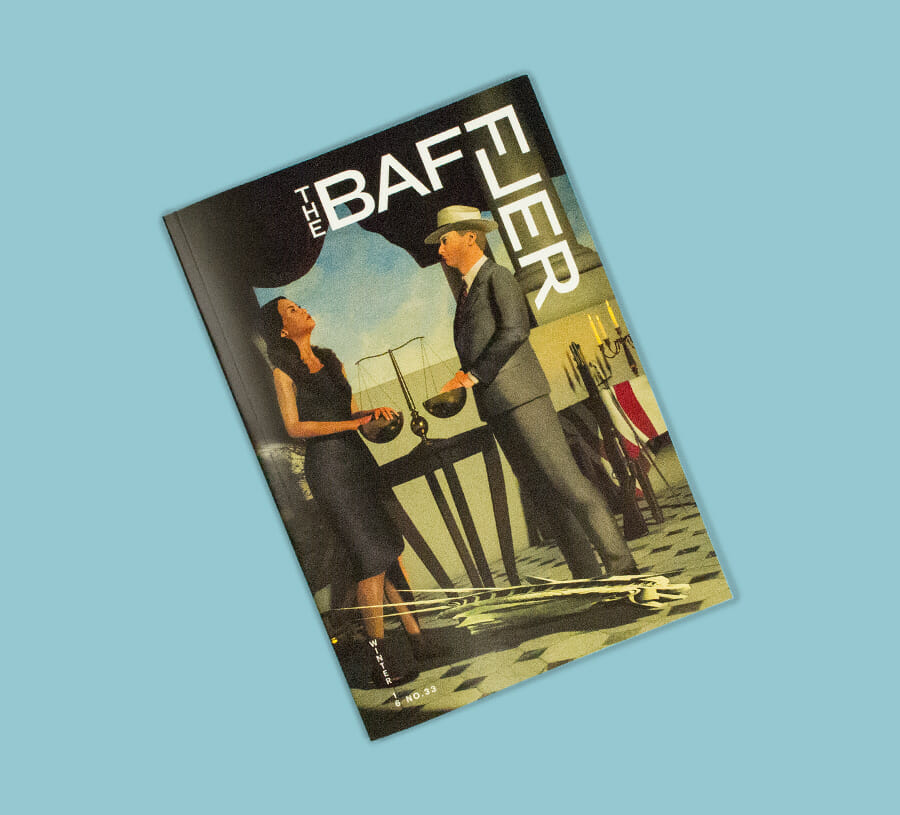
Issue no. 33. / Clay Rodery
Hello Baffler Readers!
I’m writing to alert you that when the Winter 2016 Baffler hits the newsstands, it will come bearing more than the usual roster of polemic salvos, well-wrought culture critiques, and pleas for incremental upticks in collective sanity. For the first time ever, The Baffler has undergone a top-to-bottom redesign. The design wizards at the Pentagram firm have given us a new logo, an impressive array of fonts, and some truly elegant layouts in which to feature our grade-A, ill-tempered content.
Don’t be scared or dismayed, though: just because The Baffler is looking much spiffier, that doesn’t mean our other rough edges have been smoothed out. In the aftermath of the most gruesome presidential election in our modern history—with an assemblage of prospective cabinet appointments who seem to double as Stephen King villains—Team Baffler will stand firmly at Armageddon, rousing the embattled radical egalitarian tradition in the dark days ahead with lungs a-blazing. We’ll just be doing so from a more graphically sophisticated perch than you’re used to seeing. After all, to quote the great labor hero Big Bill Haywood, “Nothing’s too good for the working class.”
Yours in struggle,
Chris Lehmann