
The Welcome to Fabulous Las Vegas sign stands on Las Vegas Boulevard, four miles south of the city, in an area called Paradise. Its white plastic casing, which sits high on twin blue stilts, is cut into a dilated diamond shape lined with bulbs. Across it, a series of discs spell Welcome, each letter inscribed in red neon. Below it, to, followed by Fabulous, painted in bedroom-blue cursive. Under that: Las Vegas, Nevada. Above it is a crowning neon star, flashing orange to red. Late every day, the sign is enclosed by darkness. Suspended as if without a scaffold, this lit object appears as an image that has, for over sixty years, solicited many more.
I saw Betty Willis’s sign over a decade ago on a trip to Las Vegas. I went to the Neon Boneyard, part of the Neon Museum, a fenced lot on the outskirts of town where retired neon signs were stacked deep along the edges. Willis was mentioned by a volunteer guide, and my ears pricked at the detail of a woman’s name I’d never heard connected to a body of work I already knew. Back home in London, I began to see Willis’s design everywhere: plastered to the window of a decrepit internet café, on the facade of a low-cost pizza joint that adopted her central bulb-lined casing, printed on the washed-out T-shirt of a weary young blonde serving drinks in a theater bar. Women neglected by art history are legion, but the scale of the discrepancy in this case was striking: Willis had created one of the most famous images in the world, yet so little has been written about her, her signs, or their inimitable, high-watt legacy. They have shone brightly since the 1950s, illuminating those who’ve toiled in this wired oasis set upon a Nevadan basin, and been captured in millions of pictures that circulate so widely beyond it.
In the years since its installation in 1959, Willis’s Welcome sign—along with the myriad trinkets upon which it is reproduced—has been readily consigned to the aesthetic category of kitsch: the morass of the tasteless and trashy, the entertaining and unserious. But to dismiss it this way is to miss its original place in the American midcentury, its prominence in histories of the spectacle and popular culture, and its story in the life of a woman who was a master engineer in the circuitry of consumer desire. Her sign is by now so wholly and globally metabolized that from its image comes a feeling that surges fast, like a pulse.
The House of YESCO
Betty Willis’s design heyday in the 1950s coincided with the local tourism board’s careful rebranding of Las Vegas and what was called locally “the war on vice.” Since the city’s first land auction in 1905, when gambling and the sale of alcohol and sex were largely zoned into two blocks (16 and 17), Vegas’s unique selling point had remained fixed on this unholy trinity. But the triad shifted somewhat in the early 1950s when the city ramped up its policing of brothel prostitution: women stepped, figuratively speaking, from the downtown brothels onto the casinos’ dining-hall stages. Industry remained determined to stimulate and mine nocturnal desires, but its methods became visual rather than fleshly. Las Vegas engineered itself as a fantasy realm, where you would come to indulge whatever impulses might previously have been—or remained, in the outside world—confined to the imagination.
Upon this desert patch, all manner of artifice ensured sublime arousal for the men and women who came here.
Tonally, neon proved the perfect accompaniment. When her Welcome sign was installed in 1959, Willis had already been working with neon for the better part of a decade. Having trained in Los Angeles at the ArtCenter School (now the ArtCenter College of Design in Pasadena) in the mid-1940s, she returned to her home state of Nevada, where she found a job at the Young Electric Sign Company (YESCO) in the early 1950s. It was just after the war: qualified men remained a scarcity in many industries, and trained women had a competitive edge. Her first assignment for YESCO was to design ads for the El Rancho, the first major hotel-resort on the Strip. Defined by poolside loungers by day and gamblers by night, the El Rancho featured headlining entertainers like Joe E. Lewis and the burlesque dancer Lili St. Cyr, who was adored and maligned by the American public and heavily imitated by Marilyn Monroe. Willis worked on ads featuring the casino’s most distinctive female performers like Carmen Miranda in her trademark oversized hat.
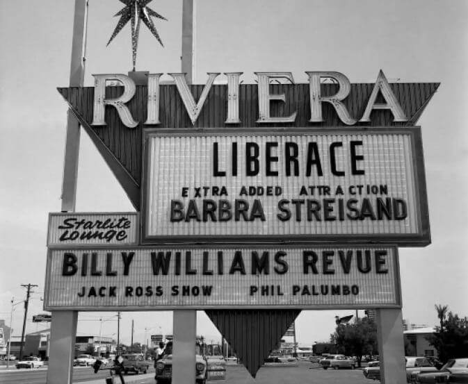
From there, she moved to YESCO’s competitors Western Neon, where mentors guided her through neon glass fabrication, pylon architecture, steel cutting, and wiring. The Riviera was her first design for a freestanding roadside sign, made of a marquee advertising headline acts, topped by the venue’s name in capitalized neon letters, which were set within evenly spaced circles painted like three-color casino chips. “LIBERACE: GEORGE LIBERACE ORCHESTRA” appeared on the marquee for opening night when he came, dressed in Dior, to perform for the enraptured crowd. Willis’s sign matched his exaggerated theatricality, their pairing the epitome of camp.
The Moulin Rouge, which opened in 1955, gave Willis a significant commission for a facade sign. A new, modernist-style pink stucco building in two adjoining parts, it was also the first desegregated casino-hotel in Las Vegas (majority-owned by white businessmen but Black managed and staffed, and patronized by Black and white alike). Willis designed the sign mounted above the main entrance: “Moulin Rouge,” written in neon-lined steel, with its uppercase M and R frames wrought into imposing swooping shapes modeled on French typography, reached wide across the flat roof of the hotel-casino. Below this main marquee, where the guests were greeted, hung three mounted neon outlines of various figures—entertainers, dancers, and a cleaner. Despite its popularity among locals, visitors, and international entertainers, the Moulin Rouge was shuttered by the end of the year (sabotaged, some say, by the mob). But it briefly attracted some of the icons of its day, including Louis Armstrong, Sammy Davis Jr., Lena Horne, and Sarah Vaughan. On opening night, Black dancers performed the cancan, which made the cover of Life magazine.
Around two years later, Willis was commissioned by the Blue Angel Motel. Along with a sign, she designed an elevated, sixteen-foot angel wearing a blue evening gown with a sweetheart neckline, red lipstick on, her blonde hair hanging loose down her back. A rotating sculpture (or “rotisserie figure”), she revolved on her mechanized base, continually pointing a wand at her surroundings. For the fabrication, Willis had drawn an angel carrying a ribbon and encircled by birds; she sent the sketches to a California company that fabricated models for shop windows. They rendered it and shipped it back to Las Vegas, where two set designers she knew “finished it in their back yard.” Although popular once installed, there was some initial dissent. “I got criticized for depicting a super-well-endowed angel,” Willis remembered. “I said, ‘Well show me an angel, and I’ll draw her.’”
The latter part of the 1950s brimmed with commissions for Willis: the Little Normandy, the City Center, and the Del Mar on Motel Row, a rapidly developing stretch on the Strip. One postcard of the Del Mar described the area as “the heart of playland.” She was drawing shapes across the city’s skyline, filling it up with ornamental clutter. “In those days,” she recalled, “salesmen would stand out in the street with the cars and a camera, because you designed a sign around the hole under and over the other signs.”
By Willis’s account, the Welcome sign came into being through Ted Rogich, her colleague at Western Neon. He was a prolific salesperson who regularly drove around the city’s periphery scouting sites to pitch. Patrolling the night sky from his car with his camera, the view from the site in Paradise would have shown Las Vegas’s dazzle in relief, behind which snowy mountains marked the desert’s craggy circumference. It’s likely Rogich shared a photograph of this promising aperture on the horizon with Willis. Into this pocket of darkness, she first envisioned the sign. A representative of Western Neon sold the vision to Clark County in February 1959, and by May of that year, Willis and her colleagues had translated the piece from watercolor sketches to its working wired three-dimensional form.
As a sign, Welcome to Fabulous Las Vegas has remained in situ for over sixty years while many of its contemporaries have since been demolished, remade, or consigned to the Neon Museum. Willis’s creation has been leased to the county by YESCO; two newer replicas are also situated at different sites in town. As an image, however, it was never protected by copyright, and so its face is routinely copied without permission or payment.
Willis died in 2015, by which time she had achieved local fame and widespread affection, and the sign’s image had become very famous indeed. This was a good thing, in principle, except that she had never earned anything from it after her original fee, and even those payments were less than her male contemporaries received. Despite this, Willis remained upbeat about how diffused the image of her work had become and its enduring value as a symbol of her beloved town, appearing on commemorative licence plates and McDonald’s drink cups, recreated on the set of one of her favorite television shows, Wheel of Fortune. She was routinely sent press cuttings featuring images of the sign from around the world, she told one interviewer in the late 1990s—from “Tokyo, Iowa, Missouri, Texas.” She referred to it variously as an icon or emblem of the town. As she quipped in an oral history of the same period, “You just throw that up behind the girl that’s doing entertainment and you know you’re talking about Vegas.”
Bliss Circuits
“The girl that’s doing entertainment” is the kind of slip that typifies an oral history: a document that simulates a conversation, an imperfect process of remembering funneled through a glitching speech pattern. But Willis’s statement also makes sense on its own. Girls were “doing entertainment”; generations of young women sang and quipped and danced and stripped as Willis was making signs, turning her detailed sketches into contoured steel. The verb was active, and these simultaneous efforts of Willis and the girls onstage were frequently paired. Performing women and a woman sign-maker were all producing lit objects to electrify casinos and excite increasing numbers of visitors. Neon, like performers, required viewers to look up and let go. They created a contemporary form of stargazing that was intended to be sensual and arousing—that promised a transcendence of sorts, through lusting and spending.
The Welcome sign’s crowning star, Willis once said, was inspired by a twinkling star in a Disney logo from the 1950s. Disneyland opened in 1955, another weekend resort accessed by car that was centered on multiple glittering attractions around which the crowd was encouraged to flow, testing out the hypnotic powers of experiential consumerism. But unlike Disney, where the fairy tales were prefabricated, Las Vegas offered the kind of fairy tale you could write for yourself by trying your luck at the casino.
In another astronomical reference, the sign’s central diamond looks air-bound: wide at the center and pointed at the upper and lower tips, hinting at the lunar ambition of the era. Willis designed it two years after the first orbital spaceflight and a year after the launch of satellite Explorer 1, just as California’s “Googie architecture” was emerging as a distinctive and futuristic architectural style. Named after the Googie’s Coffee Shop on the Sunset Strip, the term described what were often roadside buildings engineered in steel and glass, many decorated with neon, the roofs of which veered deliriously upward, as if wanting to break free into the skies. Of course, this shape also recalls the pluming aftermath of an atomic bomb, another sensational feature of the early 1950s Nevadan sky. Regular, pre-dawn blasts from a test site only about sixty miles outside Las Vegas were swiftly turned into tourist events, with bars sectioning off dedicated viewing areas and serving special atomic cocktails from waitresses done up in atomic-themed outfits and hairdos. Then came a succession of beauty contests: Miss Atomic Energy, Miss Atomic Bomb, Miss Atomic Blast, Miss North Las Vegas Atomic Bomb Contest, and so on. Light and intensity, clarity and beauty, awe and arousal: neon, like nuclear explosions and nubile women, yielded oneiric displays of color, shimmer, and contour. Upon this desert patch, all manner of artifice ensured sublime arousal for the men and women who came here.
Fabulous, the word Willis inserted in her sign to distinguish it from others, was a popular adjective that popped up in slogans across town, from the Fabulous Flamingo, to the Fabulous 50s slot machine, to Eddie’s Fabulous Fifties. I imagine this adjective in its essence much like Las Vegas of this decade, containing within it a radiance that holidaying suburbanites yearned to inhabit. In Willis’s sign, Fabulous sits directly below Welcome, hitched to the line of neon discs that hang there like casino chips, prizes that could be yours if you just reached out to grab them. The symbols Willis fashioned in her sign project a narrative of flight and futurity, of abandonment and risk, of leaving it all behind for fast cash and bedroom-blue rewards. It was an icon envisioned by a woman; the message it sent out was one of possibility, and the feeling it sought to elicit was bliss.
The measure of excellent design is that, done well, it appears less like a freshly hatched graphic and more like an inexorable fact, synonymous with its product and undiminishable over time. This is true of Willis’s work, unscathed as it has been by competition and lighting trends and the advancements of computer-aided design. “You’re not going to replace art,” she said of her manual process at the turn of the millennium. And she had long identified with this word, since at least 1944 in fact: a Los Angeles voting register from that year lists her name among four hundred others, each declaring a different profession (housewife, secretary, typist, seamstress). In this document, her entry alone reads: artist.
Signs and Symbols
Tourist photographs of Willis’s Welcome sign date back to the year it went up. Oldsmobile drivers began routinely parking alongside it to shoot smiling sweethearts waving from their vehicles, souvenirs to show folks back home. Postcards of it were sold downtown. This in itself wasn’t new: postcards of welcome signs (arches, originally) had been beckoning prospective visitors to new towns across the United States since at least 1907 with their color-tinted chromolithography. But within this emerging genre, Willis’s Welcome sign quickly graduated to the status of a national landmark.
As a sign, Welcome to Fabulous Las Vegas has remained in situ for over sixty years while many of its contemporaries have since been demolished, remade, or c onsigned to the Neon Museum.
Today, her sign’s image remains frequently reproduced by people drawn to her illuminations, much like I was. Cinema provides a bounty of images of Willis’s work, as does photography, and their impressions materialize in other forms too: in literature, philosophy, and architectural theory; in fashion, retail, advertising, and merchandise of all quality and scale. You can see Willis’s design in roguish replica stage lights or on street signs, in apocalyptic video games and on junkshop trinkets. This composition, which started life as just that—a drawing—materialized as a steel, plastic, and neon object that has seduced all kinds of lenses. I suspect that when you put this essay down, you will start to notice the imprint of her signs everywhere. You might choose to read the connections between these sightings. For me, Willis’s signs have become lodestars to an exceptional history, illuminating instances of creativity, autonomy, and opulence in the American midcentury for those escaping the banality of suburbia, the drudgery of low-paid work, or the hellscape of heteronormativity and discrimination at a particular moment after the war and before the fraught feminist waves that followed.
Most recently, the Welcome sign featured prominently in Baz Luhrmann’s Elvis (2022), but one of its earliest appearances was in The Velvet Trap (1966) directed by Ken Kennedy. The film follows a gauche waitress named Julie through a sequence of exploitations. As she is driven into Las Vegas in the morning light, the Welcome sign comes into view through the windshield. For Julie, who has just been raped, the sign represents a new start; an escape from her work at a diner; a glimmer of indulgence, or some kind of romance. That evening, after a day of bikini modeling for a wily photographer named Brad, Julie steps out with him in a reflective silver cocktail dress. The pair visit casinos, where they gamble, drink, dance, and enjoy live entertainment, their image double exposed against roving shots of casino exteriors on Fremont Street and the Strip, the flashing and pulsing neon signs emphasizing the hypnotic quality of the place. Julie, unaware of her impending downfall, is captured on the threshold between grim daily reality and orgiastic sensation. Suspended in celluloid between city street and Nevadan sky, beyond trauma or tedium, she seems, at least temporarily, free.
Cinema is a long-established fantasy space, a medium Annette Michelson described as “a dream for waking minds.” Figures shot in Las Vegas often overlap with signs in the frame, making them appear phantasmagorical, as if dislodged from the earth. A similar method of elevation through double exposure had appeared in Roy Rowland’s Meet Me in Las Vegas (1956), where a woman dancer pairs up with a cowboy in pursuit of good fortunes as they gamble their way across town—her visit proving a positively liberating experience. But a decade later, traveling along the same routes, there is no happy ending for The Velvet Trap’s Julie. After her big night out, she becomes ensnared in a prostitution ring. In the movie’s brutal framing, there is comic tension not in the details of Julie’s exploitation but in her expectation that she might be deserving of something more.
Any great high is followed by the inevitable comedown, and as Las Vegas’s filmography pushed into the 1960s, women in particular fell victim to gravity’s inexorable pull. Willis’s sign became increasingly associated with cheap, shallow forms of entertainment that were either embraced or vilified, and which many intellectuals held in disdain. Writ into Las Vegas’s neon “spectacular” were the mechanics of what came to be theorized as the “spectacle.” Jean Baudrillard wrote about the town’s “prodigious confusion of effects” and its “waltz of simulacra and images”; he called it an “acme of prostitution and theatricality” and positioned himself as a dazzled client of this “great whore.” Baudrillard wrote this like it’s a bad thing he happened to be okay with, when actually it’s a fine description of what made the city the most mesmerizing of Western metropolises. It was the American dream distilled into a landscape of hedonistic near-hallucination, where women were pivotal, working night and day as symbols and sign-makers, seductresses and seamstresses, servers and spendthrifts.
This small enclave was also a proximate but antagonistic outlier to Hollywood, with its production-line depictions of conforming wives; it was a city of lights that read as trashier, flashier, and bustier than Paris or New York. In the wake of the Welcome sign’s installation, Vegas became a destination not only for tourists and drifters but for a wave of observers interested in the counterculture and the avant-garde. The city provided the setting for a great swath of literature, performance, and art, as well as B-movies, skin flicks, and other low-budget productions in which Willis’s work once again played a starring role.
A mid-1960s postcard reproduction of Willis’s sign appears in Learning from Las Vegas, the architectural study written by Steven Izenour, Denise Scott Brown, and Robert Venturi that became a landmark in the literature of postmodern architecture upon its publication in 1972. This destination was Scott Brown’s idea; while teaching at the University of California, Berkeley, she made several trips to Las Vegas with her camera, resulting in a keen-eyed body of photographs of neon by night. In Learning from Las Vegas, the postcard is printed as part of a collage, affixed to a scaled-up road map of Rome. The sign is pictured against a clear sky. To the upper left margin, “Arrived Safely” is written in cursive; to the right of Willis’s star, “Really!”; and, below that, “Seeing the ‘Town.’” How did this strange collage come to be? I imagine the postcard was sent to Venturi from Scott Brown on one of her early trips. Maybe she liked the sign, the postcard’s strange punctuation, the word town airlifted from its image by quotations—satisfying their mutual conviction that all towns were, at one time, just a bright idea. Card upon cartograph, this collage fuses the couple’s different approaches, a synthesis that became a marriage, a book, an architectural practice, and a working life that often bestowed Venturi sole recognition for their shared accomplishments, including the Pritzker Prize in 2013. In the book, the collage is labeled “Nolli’s Map of Rome” after Giambattista Nolli, eighteenth century cartographer of urban space. Willis’s name is omitted from the caption in a disavowal of half the work’s influences.
Other West Coast observers of nonconformity and surface irregularity arrived in the city during this period. In her Corvette Stingray, Joan Didion sped cross the Mojave, where she saw Willis’s signs “looming up from that moonscape of rattlesnakes and mesquite.” In her 1965 essay “Marrying Absurd,” she wrote about Las Vegas’s marriage industry. Didion scrutinized the love-struck and the just-hitched and the chapel queues that separated them. She distinguished Las Vegas from its neighboring ranch towns, Reno and Carson; unlike them, the city seemed “to exist only in the eye of the beholder.” Didion returned to Las Vegas on multiple occasions, where she set part of her novel Play It as It Lays, which she later adapted for the screen with her husband, John Gregory Dunne. In the background of the film, casino signs like Willis’s loom. Maria, played by Tuesday Weld, submits to their colors and “light intensities” while unraveling before the camera.
Women unraveling in Las Vegas became something of a cinematic trope, appearing with a frequency that began to attract artists and filmmakers keen to explore gender in movies and the culture industry. What they, in turn, produced were neither the promised fortunes of Meet Me in Las Vegas, nor the cheap-shot morality tales of The Velvet Trap, but more experimental studies teasing out the conditions of female downfall.
Feminist filmmakers embraced the town’s spatial and temporal idiosyncrasies to accommodate studies of refusal. In Yvonne Rainer’s feature Film About a Woman Who . . . (1974), for example, Willis’s Motel Row is visited by a female protagonist who, after three days of leisure, “began to panic.” Rainer, steadfast in her anti-spectacular strategies, declines to shoot this moment of terror in her protagonist’s face, announcing it instead though voice-over—a conspicuous omission that denies the audience the satisfaction of climax. Three decades later, Joan Jonas came to Vegas to make videos for her multimedia performance Lines in the Sand, casting various women as historical muses (the poet H.D.’s Helen in Egypt and the Ulster Cycle’s Queen Maebh), the city lights symbolizing the mythic qualities of Americana. Each costumed figure she shot is reduced to basic repetitive movements, their working bodies superimposed against scaled-up Las Vegas signs. Projected on loop, Jonas’s video installations emphasize the endless labor of the ogled object: looked-upon women akin to flashing signs. And in Queen of Diamonds (1991), Nina Menkes filmed her sister Tinka playing the part of Firdaus, a blackjack dealer and drifter. Spreading cards across green felt tables with her acrylic red nails, the murmurs and flickers of a casino surrounding her, she seems ghost-like, vacant. Between shifts, she walks languorously, with Willis’s Blue Angel—an equally spectral presence—turning circles behind her. It is one of a series of films by Menkes about women who say no to everything because, as she put it, “What can you actually say yes to?”
Rather than pull focus on one seismic breakdown, these works linger on the brink of it, and how interesting that they do so at a site so frequently associated with gratification. Who sustains the spectacle’s frontage, this Paradise? they demand in raspy chorus, as Willis’s designs blink and swivel in the backdrop.
Doing Entertainment
From London, I look up Willis’s Welcome sign on Google Street View. The sky around it is piercing blue. I spin the compass function 180 degrees so that the sign is behind my back, and what faces me are about four carloads of tourists standing in pairs and trios. They are pixelated, reduced to clusters of light. The ones nearest the sign are holding their hands aloft, wielding smartphones, photographing Willis’s work. I flip 180 degrees again so that my back is to the visitors, and I face our shared focal point with its great diamond shape, those bold typographies, that flashing star. Beside the two stanchions is a slight disfiguration, and I zoom in to realize it is the figure of a woman. I had missed her at first. She’s dressed in earthy colors, like the scrub behind her. Her left arm holds onto the blue steel of the sign. I can see nothing of her expression, but it’s clear she’s posing: the curve in her back, the arch of the shoulder, her slight weighting on one leg. The posture is familiar. My six-year-old daughter has recently learned to hold her body this way for the camera, like she’s “doing entertainment.” Quite beyond her knowing, she’s already performing in a repertoire some might call Fabulous.
Betty Willis was drawing shapes across the city’s skyline, filling it up with ornamental clutter.
Philip Larkin, observing a fourteenth-century marble effigy of a couple standing hand-in-hand, concluded prosaically that “what will survive of us is love.” Looking at Willis’s Welcome sign—rendered in CGI, photographed, filmed, typeset, staged, or animated across a great range of different channels and surfaces—I suspect that it is the icon of our era: the ultimate expression of the fact that what will actually survive of us today is want. For people harnessing or exploring this human impulse, for the industries that entrap it, Willis’s design has become shorthand for the promise of paradise, the sense that something, somewhere is better than this.
The sign’s longevity and mass appeal derive in part from how often its face was paired with those of women, the combination powering the fantasy economy of Las Vegas, stoking desires and appetites. Somewhere in the city’s matrix of electricity wires, steel scaffolds, and blown glass, women were writing their own stories of power and light, of the spectacle and of seduction. Willis’s 1950s and 1960s seem anomalous in hindsight, asynchronous from the standards of the day. Not that these decades here were in any way a feminist utopia because without a doubt multiple forms of discrimination thrived in Las Vegas. Nonetheless, this small incandescent place presented an altogether different proposition for women of the age, offering opportunities and freedoms no other cities could or would. Objectified, they were, yes, but object-makers too: owners of their own destiny. These women found a place to work, whatever way they could—creatively, independently, fiercely, soliciting human desires through a constellation of prismatic multifaceted objects, elevated high and lit brightly.