Eat Your Chart Out

Watching the emergence of the online right in the past year or two, from a certain point of view, grants the stolid researcher access to a unique bundle of neuroses and obsessions. These psychic disorders began on the outer reaches of the web before they oozed into the new Trumpian mainstream of Republican thinking. Along with the boom in reactionary politics has come a whole host of related aesthetic quirks, among them a genuine obsession with terrible, borderline nonsensical charts.
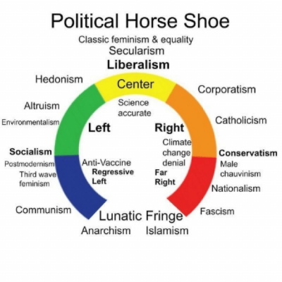
Take even a cursory tour through right-leaning comment threads, Facebook posts, and Twitter tirades, and you’ll see them. Someone will drop one of those graphics into the thread, expecting a refutation. Aside from the truly terrible choice of fonts (haven’t these people ever learned to kern, for God’s sake?) these charts have nothing, nothing to do with the actual state of things. A good example is the chart below (see figure 1), recently tweeted out approvingly by self-appointed avatar of classical liberalism and online talk show host Dave Rubin, who, in spite of being in possession of a political science degree, was able to look at this image and think it was something that could reasonably explain political reality. The longer you gaze at the image, the more it churns up things that are just wrong. To get to socialism you have to get through both hedonism and altruism. Environmentalism leads into . . . anti-vax beliefs? Corporatism being a lead-in to Catholicism is another baffling choice—particularly given the long history of liberation theology and the current pope’s quite trenchant criticisms of materialism, rampant corporate capitalism and environmental ruination.
Tempting as it is to dismiss this kind of thing as just the nature of the web, it’s important to try and figure out how these things come to be produced—and, more important, how they can reasonably be taken to be accurate by people like Rubin and his hundreds of thousands of followers. The answer helpfully appears here in the center of the horseshoe, that wonderfully meaningless two-word koan “science accurate.”

Aside from the obvious ideological positioning of a stalwart defense of the status-quo as both sensible and praise worthy, there’s a crude scientism at work in the right-wing chart industry that favors quantities of data over qualitative information. If you have charts, you see, you have facts. And those facts are not things that need interpreting. Facts are not changeable, and they don’t permit the crude sloganeering of some PC virtue-signaler to carry the day.
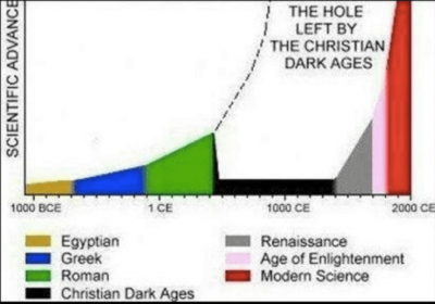
This tacit claim to unassailably science-accurate capital-T Truth is immensely convenient for ideologues on the right. It also goes some way toward explaining the prevalence and the function of these terrible charts. They made their initial appearance in the enormously self-serious musterings of religious skeptics and new atheists on the early web. Just consider the chart below (figure 2), which has been floating around atheist circles online since at least the late 2000s. The amazing measurement of “scientific advancement” on one axis with an incredible misunderstanding of how something like knowledge gets transmitted makes this chart a vintage example of the genre. What is truly wonderful about this particular graphic is its self-deconstructing didactic mission: to drive home the supposed dangers of the Christian Dark Ages. In reality, this graph, so beloved of the old anti-theist crowd, seems to be an almost direct descendant of the ones used by the capitalism propagandists and evangelical Christians behind the worryingly successful PragerU YouTube channel. (The YouTubers Shaun&Jen discussed the superb examples of terrible charts found in Prager’s videos in a video here.)

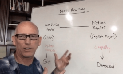
That motley origin story also drives home the real collapse in consensual inquiry that these charts inadvertently dramatize. Without shared agreement on facts, common ground and political discussion become increasingly unlikely. Instead, what we end up with are distinct conceptions of not just politics, but of the facts that supply the foundation of political inquiry in the first place. What we see in these terrible graphics, these bizarre memes and these willfully obtuse charts is the vanishing of a shared political vision, replaced by a completely imagined political reality. The French philosopher Jean Baudrillard wrote about this process in his 1981 study, Simulacra and Simulation. Political reality in the age of simulacra becomes hyper-real, Baudrillard argued—more real than the real—and as a result, the real political and material reality that we all share is abolished. In its place, as we see daily on the online right, is the jury-rigged shareable meme that both imposes order on a (now completely imagined) political universe and becomes accepted as being the actual, true state of things. Hyper-reality expressed in easily compressible jpeg form becomes the ground for politics. This is the way that we can start to understand not just why these charts and graphs and infographics exist, but more fundamentally, what they do. The intellectual work done by these charts is to abruptly impose a degree of order onto a world that often seems to resist right-wing and conspiratorial political analysis. If the chart explains what previous charts have already seemingly established as fact (a process Baudrillard referred to as a kind of “homeopathic grafting”) then these charts really do explain the world—it’s just that the world they explain exists nowhere real. It’s for this reason that the perpetually angry and online right clamors for something like figure 3, a chart designed by cartoonist, self-appointed brain genius, and “master of persuasion” Scott Adams. In a wonderful, and presumably unintentional, self-own, Adams’s Plato-for-dummies association of fiction reading with weak-kneed liberalism bluntly implies that Republicans are actually sociopaths without any empathy. More than that, though, the schematic binary that Adams graphs out here makes no allowance for a painfully obvious real-world truth: studying English would necessarily involve a good deal of reading nonfiction. Even on the literary left, it’s quite plain that Derrida didn’t write novels, and the lead thinkers of the Frankfurt school were philosophers, i.e., adepts in that most non-fictional of literary forms. (And for Adams to comprehend that many conservative figures also take literature seriously, from Tory Prime Minister-cum-novelist Benjamin Disraeli to erstwhile McCain speechwriter and fiction scribe Mark Salter, would involve brain rewiring on a scale that even the online right would dare not imagine.)
Such brute empirical facts aside, this chart can be seen by (presumably) thousands of people and treated as not just true but profound. And it is indeed the gaping distance from reality they depict and embody that lends these daft creations their aura of authority and legitimacy in truth-averse online discourse. These charts describe situations and groups of people who exist only in a symbolic and imaginative sense, but they are imaginative and symbolic constructs that command the earnest attention of thousands and thousands of people. The right-wing mania for charts doesn’t express a commitment to knowledge, but a deep investment in both fantasy and faith.

There is a long tradition of this kind of fantasy politics—the forerunner of “thinkers” like Adams and Rubin is someone like Glenn Beck. Beck’s Fox TV show, a mish-mash of mawkish sentimentality, Christian culture-war moralizing and right-wing outrage perfected its shtick with a series of now infamous chalkboard segments. Channelling some combination of the most tedious college professor and a revival preacher, Beck would lecture his audience on the “Road to WWIII,” or how, back in 2010 a “Weimar moment” was rapidly approaching. (Media Matters’ list of Beck’s predictions is well worth a read for a sampling of Beck’s unhinged histrionics.) It’s important not to just see such performative pseudo-scholarship as a joke, however; it is, rather, a symptom of something more fraught and dismaying—that these charts, and the endless regress of memes they repackage, can also actually work. That isn’t to say they are accurate or right, of course. But it is to say that all of this decontextualized and ideologically repackaged disinformation can convince people—that symbolic knowledge can create a new world inside your head.
Of course, none of this is new in the annals of Western political superstition. There have long been fields of knowledge that depended upon this kind of symbolic manipulation of information. And their adherents are not just content to describe the world, but seek to remake it, on the symbolic level. And, as a result, there have always been Gnostics, conspiracists, and seekers after hidden knowledge who believe they have discovered their own way to explain the world—with all the evidence, the facts, the graphs and charts one could wish for. Think of Samuel Birley Rowbotham, the nineteenth-century flat-earther who published his Zetetic Astronomy: Earth Not a Globe, a 430-page book, with maps and charts, back in 1881. Even further back, the alchemical symbology used in the last will and testament of Basilius Valentinus (1670) needs only a few red arrows and other photoshop elements to offer the modern right-wing online crowd a way of unlocking all the secrets of chemistry. In these historical echoes one can hear the rise of the conspiratorial nonsense spouted by Alex Jones and his merry band of conspiracists on InfoWars, and the political demonologies of occultists on the old conspiratorial fringe directly inflect what Jones and company adduce as systemic evidence of the tyrannical reach of globalists, or the Illuminati, or the ever-present threat of villainous antifa super soldiers.
And like the breakdowns of scientific and religious certainties that sparked the gnostic inquiries of centuries past, the meme-ification of terrible charts on today’s right bears sobering testimony to what politics has become in the very online age. Specifically, the right-wing chart cult prophesies the advent of a Baudrillardian enclosure of the public sphere, in which the desire for data is driving politics away from actually dealing with the world as it is, replacing it with a symbolic realm of terrible charts disconnected from reality and history itself. To be sure, the bold thinkers of the online right have no monopoly on these atrophies of critical thinking—though they have absolutely perfected the form. Indeed, you can find much the same raging chart idolatry in another group that’s managed to turn politics into a kind of abstracted fantasy—the centrist Democrat. The wonkish liberal crowd loves information, and devoutly fetishizes facts and smart graphs that can reduce the complexities of political reality into banal platitudinous data points. In this narrow compass of wonkery, matters like survival under the pressures of late capitalism can become cleverly nullified through the correct combination of tax credits and means testing. One of the ways that left-wing thought is most helpful is its insistence on materialism, on examining the world as it is. This stubborn empiricism entails not only the rejection of the conspiratorial nonsense of the online right who think that reading novels makes you an empathetic Democrat, but also the refutation of the idealistic metaphysical dreams of centrist liberals who imagine a perfectly rational consumer as the universal subject. Materialism requires a willingness to think about the real conditions of the world honestly and critically—to see the world as it is, and not as we would wish it to be. With that in mind, it’s worth remembering that the world depicted in these terrible charts, and the people whom the online right seek to describe as omnipotent political actors are phantasms—fantasies of argument that are designed to do nothing more than reshape what we think we know about the world into something else entirely. What’s vital then, is not to try to understand these baffling visuals, but instead to understand the world around us, its contingency, flaws, and fragilities—together with the ways that political analysis, connected to the material reality of the world we share can herald a new way of living, for all people.